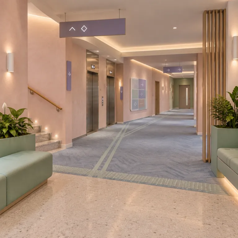
The three layers of hotel wayfinding design signage
Hotel wayfinding design signage only works when three systems align. The physical signs and wider signage design, the spatial geometry, and the lighting gradients must all tell the same directional story for guests. When any one of these systems contradicts the others, the guest experience fragments and the hotel feels harder to use than it should.
Most hotels still treat signs as a late FF&E package, not as a core wayfinding system. Yet the most effective hospitality signage strategies start at concept stage, where architects, interior design teams, and brand guardians map every guest journey from porte cochère to room. In that process, each wayfinding sign, each family of directional signs, and each set of room signs is positioned to support intuitive navigation rather than to patch over confusing planning decisions.
Think of the three layers as a hierarchy of cues that guests read subconsciously. First comes spatial wayfinding, where the plan, the corridor hierarchy, and the elevator lobby layout already suggest where to go without any hotel signage at all. Then lighting gradients and wall finishes reinforce that direction, before signage solutions and number signs finally confirm the decision at each junction.
When these three layers are coordinated, hotel wayfinding becomes almost invisible. Guests follow lighting, floor materials, and architectural openings, and directional signage simply reassures them they are right. The result is a calmer guest, a stronger brand identity, and fewer operational interruptions at the front desk from people asking where the breakfast room or meeting spaces are.
For a general manager, this is not an aesthetic luxury but a P&L lever. Clear wayfinding signs reduce staff time spent on micro directions, cut complaints about getting lost, and support safety procedures when evacuation routes must be instantly legible. In multi asset portfolios, consistent hospitality signage standards also protect the brand by making different hotels feel coherent, even when the architecture varies widely.
Why most hotel signage fails and how to specify it better
Most hotel signage fails for very ordinary reasons. The signs are too small, mounted at the wrong height, or printed in a typeface that looks elegant in a render but collapses against a textured wall in real light. In many hotels, directional signs are value engineered late, so contrast ratios, materials, and mounting details no longer match the original design intent.
From a technical perspective, the baseline is clear. For public areas, directional signage should typically sit between 1,4 m and 1,7 m to the centre line, where the average guest eye line naturally falls in motion. Type sizes must be tested in situ, not on a laptop ; a 40 mm cap height that feels generous in a PDF can become illegible once the sign is read across a 12 m lobby.
Contrast is where many hotel wayfinding schemes collapse. Dark bronze letters on a warm timber wall may photograph beautifully, but in low light the directional sign disappears just when guests need it most. Asset managers should insist on mock ups that test signage design against final wall finishes and lighting levels, not against neutral plasterboard under construction lighting.
Regulation is only the starting point. ADA and equivalent DDA requirements define minimum letter heights, tactile room number formats, and mounting positions for door signs, but good hospitality signage goes beyond compliance to support real guest behaviour. That means pairing tactile room signs with clear number signs at corridor junctions, so guests do not have to walk the entire corridor to confirm they are in the right wing.
Cost per key discussions often ignore the operational value of robust signage materials. A slightly higher specification for custom aluminium or solid surface hotel signage, with replaceable inserts for meeting rooms, can prevent repeated reprinting and remounting over the asset life. When you are modelling interior design cost per key for a renovation, signage should sit alongside casegoods and lighting as a strategic line item, not a miscellaneous graphic expense ; this is especially true in select service brands where lean staffing magnifies every wayfinding error.
Lighting gradients and floor materials as silent wayfinding signage
The most elegant hotel wayfinding design signage often is not signage at all. Guests instinctively follow light, contrast, and open sightlines, reading the lobby as a sequence of brighter and darker zones. When lighting design and floor materials are orchestrated as directional cues, the number of physical wayfinding signs required drops dramatically.
Lighting gradients can signal transitions between zones with remarkable precision. A brighter wash over the reception wall, a warmer pool of light over the lounge, and a cooler, more focused beam leading towards the elevator lobby all act as directional signs without a single arrow. Guests move towards the brightest, most legible surfaces, so a well lit elevator bank becomes a natural anchor in the wayfinding system.
Flooring does similar work at ground level. A change from stone to timber, or from terrazzo to carpet, can indicate a threshold between public and semi public areas, guiding the guest experience without any printed sign. In long corridors, a subtle inlay line or a shift in plank direction can act as a continuous wayfinding sign, leading guests towards their room without conscious thought.
For brands investing in biophilic interior design, these cues can be amplified. A band of planting or a timber ceiling raft that runs from lobby to elevator, combined with a consistent floor material, becomes a three dimensional directional sign that guests follow intuitively. When this spatial language is aligned with the graphic language of hospitality signage, the hotel wayfinding feels coherent and calm rather than over labelled.
Design teams working on wellness focused properties should treat light levels almost as a form of digital wayfinding. Dimmable scenes can shift emphasis between F&B zones and circulation routes across the day, ensuring that guests always understand where to move next without scanning for wall mounted signs. This approach aligns closely with measurable wellness outcomes in biophilic design, where visual comfort and legible circulation both contribute to reduced stress and higher satisfaction scores.
The elevator lobby as the critical wayfinding node
Ask any front office équipe where guests get lost most often and they will point to the elevator lobby. This is the node where vertical and horizontal circulation meet, where hotel wayfinding either clicks or collapses. Guests arrive here carrying luggage, checking their phones, and processing check in information, so cognitive load is already high before they even look for a sign.
In many hotels, the elevator lobby is treated as a decorative vignette rather than a functional hub. Sculptural lighting, art walls, and feature materials dominate, while directional signs to rooms, amenities, and exits are relegated to side walls or mounted too high. The result is a space where guests hesitate, turn in circles, and then ask staff for help, eroding both guest experience and operational efficiency.
A high performing elevator lobby concentrates information where the guest naturally faces when doors open. That means clear floor directory signage directly opposite the elevator, with strong contrast, generous type, and unambiguous arrows. Room number ranges should be grouped logically, with number signs that match the typography and materials of the room signs themselves, reinforcing brand identity through consistency.
Vertical circulation also needs clear safety communication. Evacuation routes, stair locations, and refuge areas must be indicated with compliant ADA and life safety signs, but these can still be integrated into the overall signage design language. Using the same base materials and a related typeface for both hospitality signage and safety signage avoids the visual clash that often undermines otherwise refined interiors.
For general managers, the elevator lobby is a prime candidate for targeted investment during renovation. Upgrading directional signage, improving lighting levels, and rationalising wall finishes here can have an outsized impact on perceived service quality, because this is where guests repeatedly test whether the hotel is easy to use. When evaluating FF&E budgets, a modest allocation to custom elevator lobby signage solutions can deliver a measurable ROI in reduced complaints and higher wayfinding satisfaction scores.
Digital wayfinding, brand identity and the risk of visual noise
Digital wayfinding has moved rapidly from novelty to expectation in many urban hotels. Touchscreens in lobbies, app based navigation, and dynamic event signage promise flexible signage solutions that can adapt to changing programming. The risk is that these layers add visual noise rather than clarity, especially when they are not integrated with the physical wayfinding system.
For digital elements to support hotel wayfinding, they must respect the same hierarchy as static signs. A lobby screen that rotates between brand storytelling, F&B promotions, and wayfinding signs every few seconds forces guests to wait for the information they actually need. Better practice is to dedicate specific zones of the screen to permanent directional signage, with only a portion reserved for changing content.
App based navigation introduces another layer of complexity. While some guests appreciate turn by turn directions to their room, many still prefer to read the space directly, especially in lifestyle hotels where the interior design is part of the experience. Digital tools should therefore complement, not replace, clear physical directional signs and room number indications at key decision points.
Brand identity must remain coherent across analog and digital touchpoints. The typography, iconography, and colour palette used in the app, on the website, and on physical hotel signage should form a single visual language, so that guests recognise directional cues instantly. When a brand invests in next generation furniture and lobby concepts, the same design discipline should extend to its digital and physical wayfinding systems, ensuring that every element supports a seamless journey.
From an investment perspective, digital signage can reduce long term printing costs for event and meeting room signs, but only if the hardware is specified for hospitality conditions. Screens must be readable in high ambient light, robust against 24/7 operation, and integrated cleanly into wall systems without exposed cabling. Otherwise, they quickly become maintenance liabilities that undermine both aesthetics and guest trust in the information displayed.
Case study logic: radial layouts, ADA and exceeding minimum standards
Certain architectural layouts make hotel wayfinding almost self explanatory. Radial plans, where circulation radiates from a clear central node, allow guests to orient themselves quickly and reduce reliance on dense directional signage. The radial layout of Hoshinoya Nara Prison, for example, creates inherently intuitive navigation from a central point, demonstrating how geometry can do much of the wayfinding work before a single sign is installed.
In more conventional double loaded corridor hotels, regulation sets the floor for legibility. ADA and equivalent standards define tactile room number formats, mounting heights for door signs, and minimum contrast ratios for safety signs, ensuring that guests with visual or mobility impairments can navigate independently. However, properties that stop at compliance often still feel confusing, because the overall wayfinding system has not been designed as a coherent whole.
Exceeding minimum standards means thinking in sequences rather than isolated signs. A guest leaving their room should encounter a clear directional sign at the first junction, a confirmation sign at the next, and then a well lit, clearly labelled elevator lobby that explains the rest of the building. This chain of cues supports both everyday navigation and emergency egress, where stress levels are high and information must be instantly legible.
Material choices also play a role in accessibility. Non reflective sign faces, high contrast between text and background, and consistent placement on the wall all help guests read information quickly, regardless of age or visual acuity. When interior design teams coordinate wall finishes, lighting, and signage materials from the outset, they can avoid the common problem of beautiful but unreadable signs mounted on equally beautiful but visually busy surfaces.
For asset managers and investors, the business case is straightforward. Properties with clear, inclusive wayfinding report fewer complaints, lower staff time spent on giving directions, and higher satisfaction scores from guests with accessibility needs. Over the life of the asset, a well designed wayfinding system becomes part of the brand equity, signalling that the hotel takes both design and safety seriously, rather than treating signage as an afterthought.
Room signs, door signs and the last ten meters of the journey
The last ten meters from corridor to room are where many hotel wayfinding strategies quietly fail. Guests may have followed directional signs successfully from the lobby, only to hesitate outside a sequence of identical doors with poorly legible room signs. This micro frustration accumulates over hundreds of stays, subtly eroding perceived quality even in otherwise well designed hotels.
Effective room signs balance brand expression with ruthless legibility. The room number must be the hero, with generous size, strong contrast, and a typeface that remains readable in low corridor light, while any decorative branding sits secondary. Mounting height should be consistent across all doors, typically around 1,4 m to 1,5 m to centre, so that guests can scan quickly along the wall without visual gymnastics.
Door signs also carry operational and safety information. Do not disturb indicators, housekeeping status, and in some cases emergency evacuation diagrams must all coexist with the primary room number without creating clutter. Modular signage solutions, where the core number plaque is fixed and smaller functional elements clip on or slide within a frame, allow for clean branding while accommodating operational needs.
For corridors with long sightlines, supplementary number signs at junctions can significantly improve the guest experience. These small wayfinding signs, mounted perpendicular to the wall, allow guests to confirm room ranges before committing to a long walk down the wrong wing. In renovation projects, adding these simple directional signs often delivers more navigational value than rebranding the entire signage package.
From a specification standpoint, durable materials and precise detailing matter. Solid surface, metal, or high quality laminates with crisp edges and concealed fixings project a sense of permanence that aligns with an upscale brand identity, while also resisting wear from luggage impacts and cleaning regimes. When the last ten meters of the journey feel effortless and well considered, guests subconsciously credit the entire hotel with higher design intelligence and operational care.
Key figures that frame hotel wayfinding performance
- In post stay surveys from major hotel groups, between 15 % and 25 % of negative comments about the physical product relate to navigation, signage, or getting lost within the property, indicating that wayfinding is a top three built environment friction point for guests.
- Accessibility audits in North American hotels consistently show that more than 30 % of properties have at least one ADA related non compliance in their signage, such as incorrect mounting height or insufficient tactile contrast, exposing owners to both legal risk and guest dissatisfaction.
- Operational time and motion studies in full service hotels suggest that front desk and concierge teams can spend the equivalent of 0,2 to 0,4 full time employees per day giving directions alone, a hidden labour cost that effective wayfinding can significantly reduce.
- In emergency evacuation drills, buildings with clear, consistent directional signage and well lit exit routes achieve full floor clearance up to 20 % faster than comparable buildings with ad hoc or poorly maintained signs, underlining the direct safety impact of good wayfinding design.
- Portfolio wide brand refresh programmes that include coordinated hospitality signage and wayfinding systems have reported guest satisfaction score uplifts of 3 to 5 points on navigation related questions, demonstrating that signage is a measurable lever in overall brand perception.
FAQ about hotel wayfinding design signage
How early should wayfinding design be integrated into a hotel project ?
Wayfinding design should start at the same time as space planning and interior design, not after finishes are selected. When architects and signage designers collaborate from concept stage, circulation routes, lighting, and wall surfaces can all support clear navigation. Late stage signage overlays rarely fix fundamental layout issues and often lead to cluttered, inconsistent signs.
What are the most common mistakes in hotel signage specification ?
The most frequent mistakes are undersized type, poor contrast with wall finishes, and inconsistent placement of directional signs and room numbers. Designers sometimes prioritise decorative materials or brand flourishes over basic legibility, especially in lifestyle hotels. Another common error is ignoring ADA and accessibility requirements until late in the process, which can force awkward retrofits.
How can general managers measure the impact of improved wayfinding ?
General managers can track several KPIs before and after a wayfinding upgrade, including the number of guest complaints about getting lost, front desk time spent giving directions, and navigation related scores in guest satisfaction surveys. Mystery shopper audits can also evaluate how quickly a first time guest finds key destinations like elevators, restrooms, and meeting rooms. Over time, clearer wayfinding should correlate with smoother operations and higher perceived service quality.
What role does digital signage play in hotel wayfinding today ?
Digital signage is most effective for dynamic information such as event schedules, meeting room allocations, and temporary routing changes. It should complement, not replace, a robust physical wayfinding system with clear directional signs and room numbers. When integrated carefully into the interior architecture, digital displays can reduce printing costs and improve flexibility without adding visual clutter.
How can existing hotels improve wayfinding without major construction ?
Existing hotels can start with a thorough audit of guest journeys, identifying where people hesitate or ask for directions. Targeted interventions such as upgrading directional signage in elevator lobbies, adding number signs at corridor junctions, improving lighting over key signs, and rationalising inconsistent graphics often deliver significant gains. These changes usually sit within FF&E and operating budgets, avoiding the need for structural alterations.